
Students wants more travel reports to research before applying for an exchange program. For this to happen, the Educational Quality Office needed a new and more streamlined method of publishing reports. The new system feeds survey responses to a standardised template, making them easier to compare and lessens editorial workload.
Create a solution that makes the reviewing of travel reports quicker and makes it easier for students to compare the reports.

We had a conversation with the client to get insight into their troubles. EQOs had the following pain points:
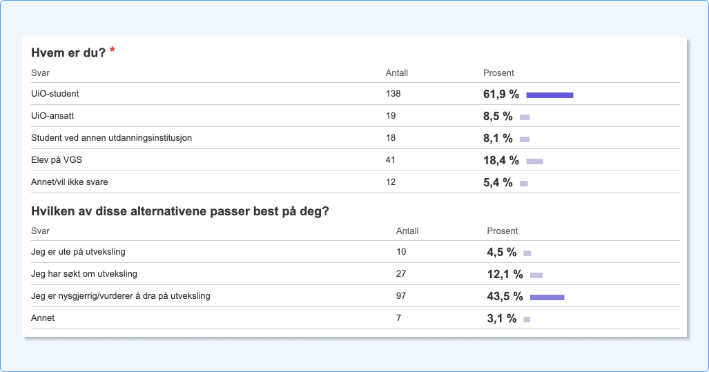
EQO provided a summary of user survey data on students researching exchange programs. The survey had 223 responses, where target demographics are 60,1%. (currently on, just applied for or contemplating exchange programs)
Note: Summary shows that feedback and requests on travel reports were given in an open question, and therefore not specified in numbers.
We looked at different universities to compare their approach to travel reports, where NTNUs solution for travel reports stood out.
Based on NTNUs rating system, we researched other services on user satisfaction and comparison systems. We've picked Booking.com a baseline on category rating.

I drew up todays user flow and desired flow, to help us get a common understanding of needed development. Flows were adjusted as needed with development team and stakeholders.

I drew sketches along market research and stakeholder conversations to validate functionality and layout elements with the team.

Collecting our prior findings, we defined these key features to be highlighted:
Wireframes were drawn combining our research findings and with project objectives i mind. Iterations were included along team meetings (including stakeholders)

Stakeholders were unsure about this approach, as they imagined students would forget the path to their program with time. We agreed to include navigation in a usability test and adjust if necessary.
Due to time constraints, we set a goal to map out desired categories. Our approach was to see students reactions and experience when filling out the survey and iterate on it as needed. We tested the survey question with 5 students currently abroad, who also tested navigating to their current program.
Outcomes:

Instead of being placed in a dedicated «travel reports» collection, new student reports are placed within their exchange program site.
The list of reports include a citation from the student along with a rating to give an idea of the overall experience.
An opened report pops up in a modal, with categories distributed in a table. They have decorative icons along their headlines to aid in quickly giving an idea of what you'll see.
